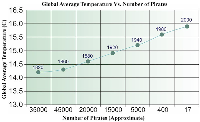
Cause and Correlation, or the Pirate Problem
As you can see from the above graph, global warming is pirate-based. It's something I think we all suspected, but were hesitant to advance until the facts could be summarized in a handy graphic.
There is something about information delivered via graph that instantly lends an air of unassailable authority. The person trapped in the cube next to you, or even the guy down at the gas station couldn’t possibly carry the credibility of a simple graph.
It is an axiom of business that any presenter worth his or her salt is going to fill their PowerPoint with charts and graphs. The more the better, and the more oblique and difficult to read the best. Data delivered with a graph says "Here is the evidence, plain and simple. Let the ascending and descending lines tell you the story."
The problem with the story, as with the graph above, is that we aren't just suckered into believing correlation implies causality. We start thinking correlation is causality. Governments, businesses and individuals make this mistake on a daily basis. It’s impossible to calculate the frequency or the magnitude of the resulting financial loss, but it’s enormous.
We all know the crowing of the rooster doesn’t cause the sun to rise. But when rates of breast or prostate cancer is associated with soymilk, or some new drug, it can frequently drive us towards some definitive action, even though the connection of data points might in actuality be more rooster/sun than cause/effect.
The correlation/causality problem goes back a long way. The early human brain, confronted by the rustling of the bush, might naturally assume it was a tiger and not the wind. Erring on the side of safety could make the difference between life and death. Assuming correlation as causality was a small price to pay. This evolution based brain bias is still part of our biology today.
Here are four questions worth considering the next time you're faced with the seductive whisperings of an X-axis.
1. Where do the represented data points come from? Groups and individuals might be selectively mining the facts based on their own private agenda.
2. What do the data points represent? Tiny samples can lead to casual conclusions that would be dismissed in a more robust survey population
3. Was this a blind study? A control group gives you some yardstick by which to judge the rest of the information.
4. Could other factors be in play? This is probably the most abused problem with the correlation/causality mix-up. Maybe there is some relation between the X axis and the Y axis, but they could just as easily be responding to some other, third influence.
In the case of the rooster/sun problem, you'd want to consider both planetary revolution and the circadian rhythms of diurnal animals. (Additionally, if you've ever been on a farm, you'll know that while roosters do crow at daybreak, those feathery little jerks will also sound their alarm in the middle of the night.)
So the next time some newscaster announces that eating peanut butter has "been linked to" autism, think back to our little graph. And remember: despite the insistence of Pastafarians everywhere (a group inspired by a modern-day Russell's teapot analogy), most meteorologists agree that pirates have next to no effect on the climate.
Fans of buccaneers, privateers, and skallywags can let out a "Yarr!" of relief.
Check out Robb’s new book and more
content at www.bestmindframe.com.


Comments
Post a Comment